May 20, 2026
Walk into any coffee shop on Brickell, any waiting room in Tampa, any beach chair from Naples to St. Augustine, and count how many people are looking at a laptop versus a phone. That’s your customer. That’s where the decision to call you, message you, or pay you actually happens. And yet most Florida business websites are still built the other way around — designed first in a desktop browser by a developer sitting at a 27-inch monitor, then “made responsive” as an afterthought for the screen your customer is actually holding.
That order is backwards. A modern Florida business website should be designed for the phone first and the desktop second — or, increasingly, designed for the phone and only for the phone, with the desktop version inheriting whatever falls out of that work. Here’s why.
The Traffic Has Already Moved
This isn’t a forecast. It’s already happened. Mobile devices account for roughly 62–64% of global web traffic as of early 2026, with desktop holding about 35% and tablets making up the remaining 2%. In high-intent commercial categories the imbalance is far more extreme: mobile generates 78% of traffic to retail sites and 82% of health-and-beauty shopping traffic. For a local Florida service business — restaurants, salons, contractors, dentists, real estate, hospitality — the buyer is on a phone. Treating the desktop site as the “real” site and the mobile version as a courtesy gets the ratio exactly inverted.
Search behavior has followed the device. In North America, mobile now dominates with 62% of internet time versus 34% on desktop, and 75% of voice search queries are initiated on mobile. When somebody three blocks away says “Hey Siri, find me a pediatric dentist in Brandon,” the answer they tap on had better load instantly, render cleanly on a 6-inch screen, and let them book or call without pinching, zooming, or hunting for a menu.
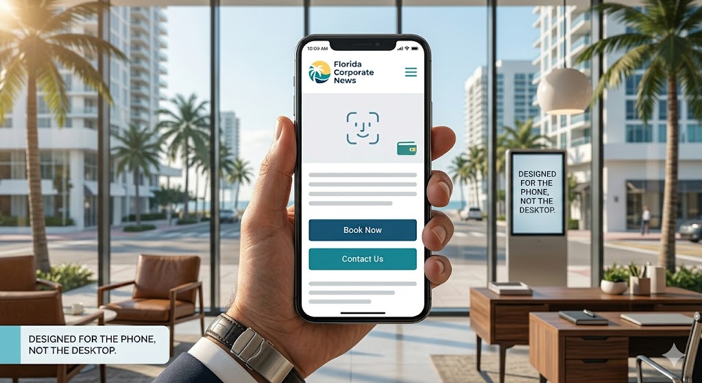
Vertical Scrolling Is the Native Language of the Phone
Designing for the phone is not just shrinking a desktop layout. It’s a different design discipline entirely — one built around a single column, the thumb, and the scroll. A good mobile-first Florida business site looks like this:
- One column, top to bottom. No side-by-side multi-column layouts, no carousels that hide content, no sticky sidebars competing for attention. The whole page is a clean vertical stack a thumb can walk down.
- One idea per screen. As the user scrolls, each screenful does one job: who you are, what you offer, what it costs, proof, location, call-to-action. The hierarchy is enforced by the device.
- Big tap targets, generous whitespace. Buttons are the size of a fingertip. Spacing is loose so nothing gets fat-fingered.
- Light pages that load fast on a phone signal. A site that takes eight seconds to render on LTE outside a Publix has already lost the customer to a competitor’s faster page.
- A persistent call to action. A floating “Call Now,” “Book,” or “Get Directions” button that follows the user down the page so the next step is always one tap away.
This format isn’t a phase. It’s the convergent design that every successful consumer app has settled on — Instagram, TikTok, Threads, Doordash, Uber, Airbnb, Zillow, the Apple Wallet app itself. Mobile share of web traffic rose from under 1% in 2009 to over 60% by 2025, and growth has consistently outpaced desktop in most regions. A whole generation of users has now been trained, by the most polished software ever shipped to consumers, that a website should look and behave like a feed: one column, scroll, tap. When your Florida business website breaks that expectation, it doesn’t feel premium. It feels old.
The Wallet Is in the Phone — Literally
The strongest argument for designing mobile-first isn’t aesthetic. It’s transactional. The phone is no longer just the device the customer uses to find you; it’s the device that carries their payment credentials, their loyalty cards, their boarding passes, their gift cards, and increasingly their driver’s license. The wallet is built in.
The numbers on that shift are striking. Apple Pay now has roughly 785 million users worldwide, holds 54% of US in-store mobile wallet usage, and processes 14.2% of online consumer payments. In-store digital wallet adoption among US consumers grew from 23% in 2019 to 43% in 2024, and Apple Pay alone is used more than twice as often in stores as PayPal or Google Pay. Mobile wallets account for 41% of in-store purchases in the US in 2025. Generational adoption tells you where this is going: more than 50% of Gen Z report using Apple Pay or Google Pay weekly, compared to fewer than 15% of Boomers.
For a Florida business website, the practical implication is enormous. When a customer is on their phone and your checkout, deposit form, or booking page supports Apple Pay or Google Pay, the transaction collapses to a single biometric tap — Face ID, done. No typing a 16-digit card number on a touchscreen. No fumbling through a wallet for the CVV. No abandoned cart because the customer got distracted halfway through a billing-address form. The same purchase on a desktop site requires a card, a wallet, and a willingness to type all of it on a keyboard. The mobile path is shorter, more secure (tokenized payment credentials, biometric authentication), and closes more sales.
This isn’t theoretical for Florida specifically. Think about the categories that drive the local economy: tourism, hospitality, dining, marine services, vacation rentals, real estate, beauty and wellness, home services. Every one of those is a category where the customer is mobile by definition — on vacation, in the car, on the boat, between meetings, walking the property. None of those customers are sitting at a desk. Designing their experience for a device they don’t have in that moment is a quiet way of telling them to come back later, which usually means: never.
Sharing Is a Mobile-Native Verb
There’s a second layer to the mobile argument that desktop-first designers miss entirely: sharing. On a desktop, “share this business with a friend” means copying a URL, opening an email client, and pasting. It’s three steps and most people never finish them. On a phone, it’s the share sheet: tap the icon, pick the contact, send. The friction is roughly zero.
That matters because most of the word-of-mouth that grows a Florida business in 2026 happens through phones — texted to a group chat, dropped into a WhatsApp thread, posted to an Instagram story, sent over iMessage with a preview card. A mobile-first website is built to be shared this way. It generates clean Open Graph previews. It has a single, memorable URL. It loads instantly when the recipient taps it. It has a single primary action visible without scrolling. A desktop-first site shared into a text thread renders as a tiny thumbnail of a cluttered hero section, with nine menu items and a sidebar trying to fight for space on a 390-pixel screen. The recipient swipes past it.
The Honest Counter-Argument
The fair counter is that desktop still matters for certain tasks. Conversion rates on desktop remain higher (around 4.3%) than on mobile (around 2.2%) despite mobile carrying more traffic, and bounce rates on mobile run about 12% higher than desktop. Some research, professional, and high-consideration purchases still happen on a larger screen. B2B buyers comparing quotes, somebody filing a complex insurance form, an architect reviewing plans — those workflows benefit from real estate.
But here’s the thing: the desktop conversion-rate gap is largely a symptom of bad mobile design, not a permanent law. Sites that are genuinely built for the phone — fast, single-column, wallet-enabled, one tap from action — close that gap dramatically. The 2.2% number is an average that includes thousands of sites that are still desktop layouts forced through a responsive grid. A properly mobile-first Florida business site doesn’t compete with that average. It competes with native apps and the best consumer products on the App Store, and on that benchmark a clean vertical-scroll page with Apple Pay at checkout can convert as well as or better than any desktop equivalent.
What This Means in Practice
If you’re commissioning or rebuilding a Florida business website in 2026, the test is simple. Open the design on a phone first. Hand the phone to somebody who has never seen your business. Ask them to do the thing you most want a customer to do — book, call, buy, schedule. If they can do it with one thumb, in under thirty seconds, without rotating the device or pinching to zoom, the site is doing its job. If they have to flip to a laptop to finish, the site is built for the wrong century.
The clean, uncluttered, single-column vertical scroll isn’t a stylistic trend. It’s the format the device demands, the format the customer expects, and the format that connects directly to the wallet sitting in their pocket. Every Florida business website should be designed to that standard, and the desktop version — for the small minority of customers who still arrive on one — can be whatever falls out of doing the mobile work properly. Not the other way around.
About Brian French
Led by a commitment to tech-intelligent curation, Brian French tracks and analyzes the corporate developments defining Florida's economy. Brian brings an extensive financial background to his analysis, having graduated from the University of South Florida in Finance and serving as a Vice President and Portfolio Manager for Merrill Lynch Private Investors and the Trust Department in St. Petersburg, FL, as well as a Vice President and Trust Investment Officer for SunTrust Bank in Sarasota, FL. His writing blends macroeconomic trends, fiduciary capital markets, corporate strategy, and modern digital insights for a sophisticated look at Florida's business market.